Adam Nickel is an illustrator living in Brisbane, Australia. Evident in his illustrations and animation, his charming cartoon style is influenced by 1950s workplaces, vehicles, and other technology. He creates his eye-catching editorial illustrations for companies such as Wall Street Journal, The Daily Telegraph, The Boston Globe, and Random House.
“I really dig the simplicity and stylishness of mid century illustration.”- Adam Nickel, 2013

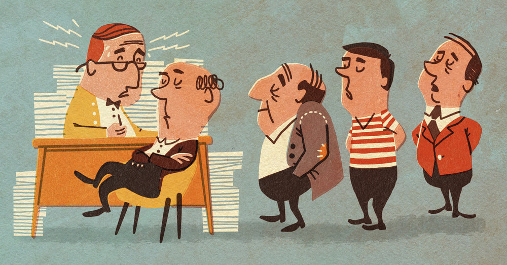



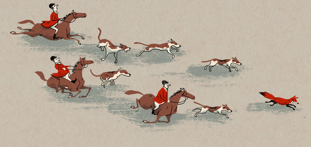

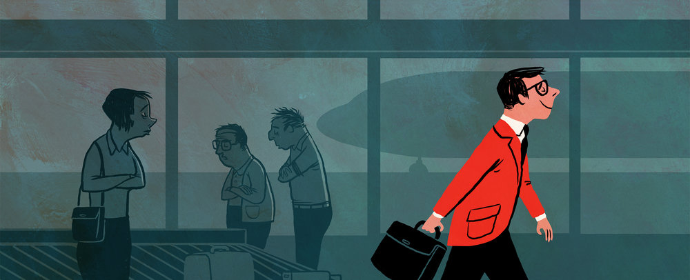
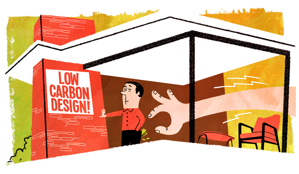
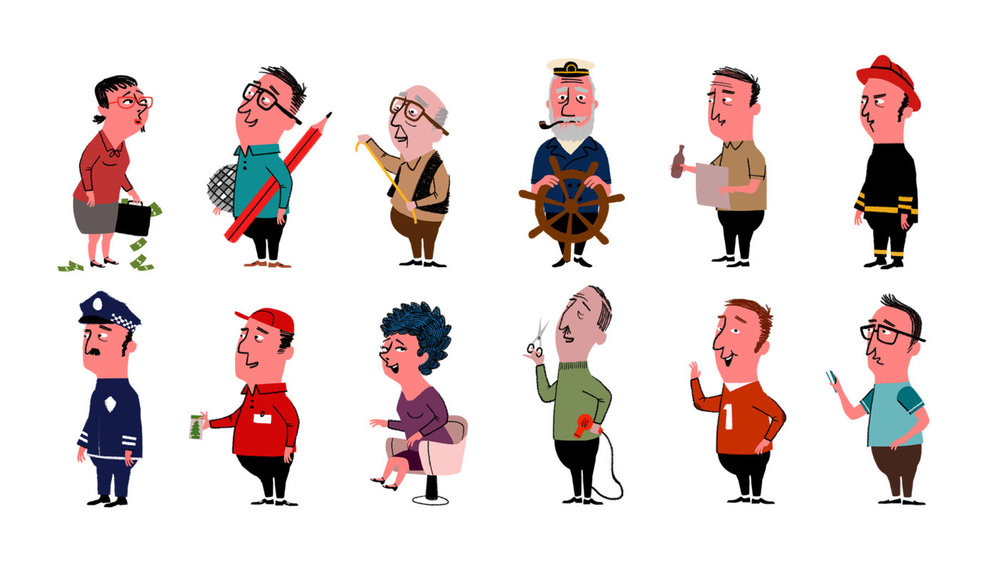
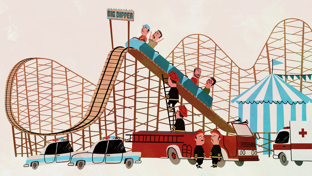






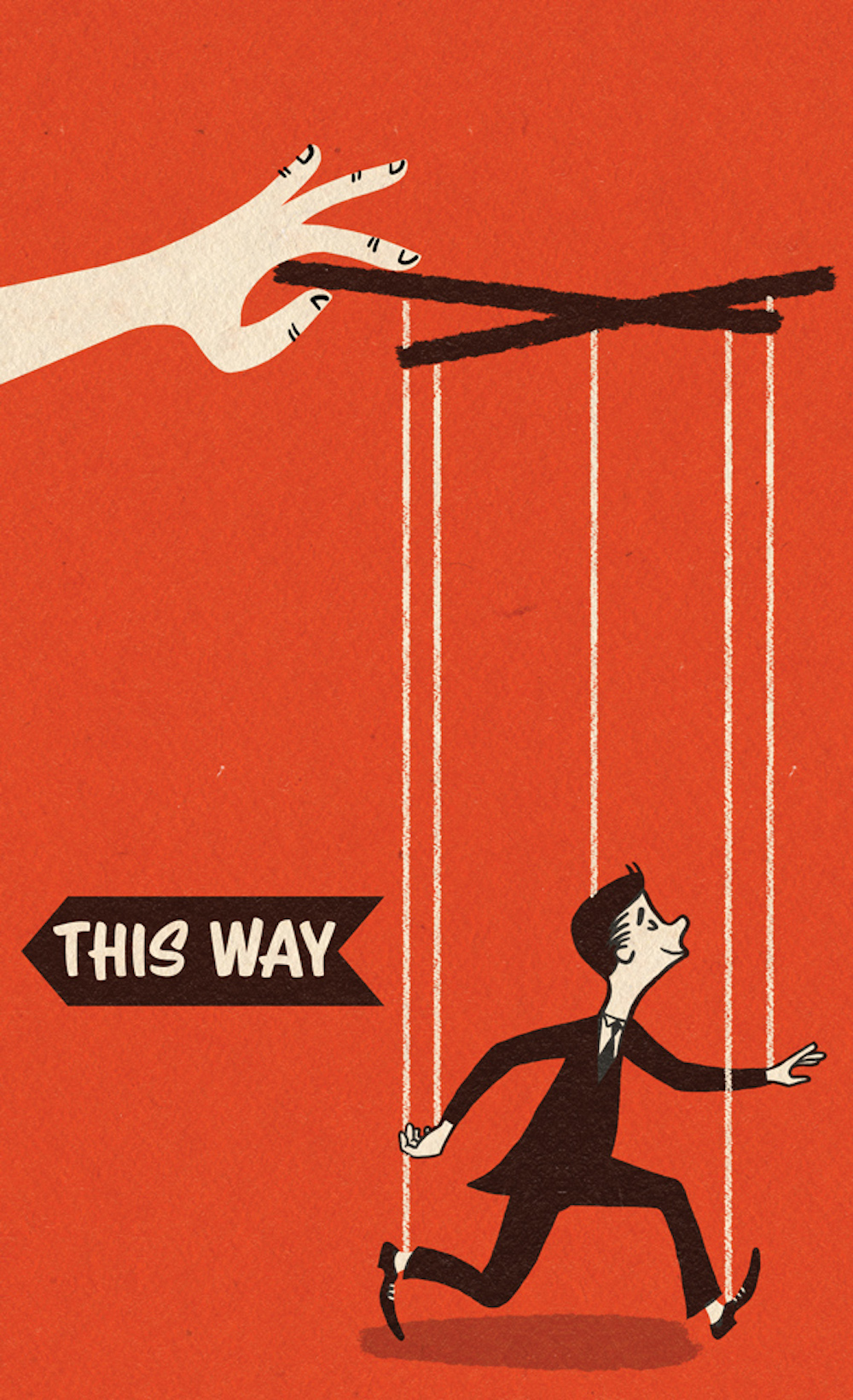
When browsing his artwork, some of the main characteristics I noticed about his art style were:
- In each of his illustrations, there’s a variety of texture, ranging from uneven edges to brush strokes to scribbles and to patterns.
- There’s a simplicity in the shapes he creates. Instead of outlining shapes in black or white, unless they are transparent or need to stand out against the background, he uses black lines to make details in the shape.
- Along with textures, solid and simple colors are used. Sometimes the colors are dull, sometimes they are vibrant. Sometimes there are many colors used, sometimes there’s minimal color to emphasize certain parts of the illustration.
- People are present in almost all his illustrations, and I admire the expressions on their faces.
- There is subtle layering in his art, which gives his style more of a 1950s feel. If you look closely, some shapes have a white shadow on the side, as if the art was printed and the ink was slightly off shifted. Also, sometimes there’s vibrant foreground, a duller middleground, and the textured background, which gives the art more depth.
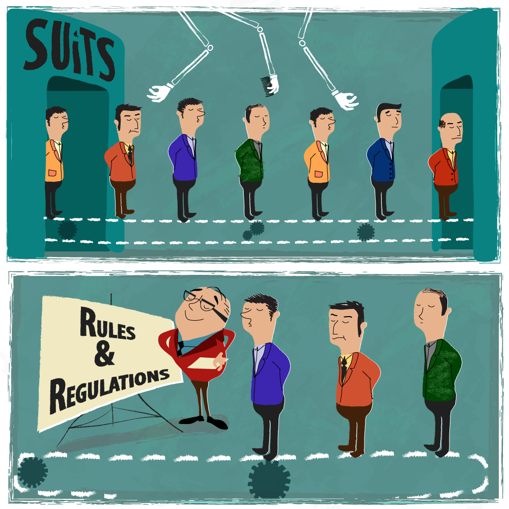
- Since some of his art pieces are editorial illustrations, they serve to mirror and clarify the message of the articles they accompany. In doing so, these illustrations can convey a story, an instruction, or a critique. Therefore, I tried to convey a criticism of the workplace within my illustration.
And finally, to unveil my attempt at mimicking his art style, with the curtains pulling back and fanfare playing in the distance, ta da!
