For my last post on this column, I wanted to finally create a creature that most people would think of when they hear the words ‘Medieval Fantasy’. So, for this final post, I’ve decided to design a dragon character.

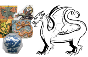
For the initial sketch of the creature, I had trouble coming up with the proportions for the body. This is probably because I lack skill in drawing animals, but I also had to find a middle ground between the European and Chinese dragons. Chinese dragons were a lot longer and more snake-like, while European dragons had more beastly proportions. I ended up going for a body that was longer than the usual European dragon, but not long enough to seem too much like a Chinese dragon. I also had trouble on whether or not to add wings. In medieval European art, dragons were always depicted with wings. However, medieval Chinese art never depicts their dragons with wings. In the end, I decided to add wings, to make the creature seem more fantastical rather than just a snake with legs.

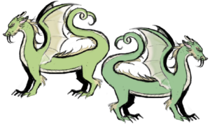
For the color scheme, I had already liked the initial colors I had chosen, which was the yellow-green color scheme. However, for the sake of experimentation, I went for a slightly desaturated cooler version of my first drawing. I felt that this sucked the life out of the dragon, so I ultimately decided that the brighter color scheme would work better.
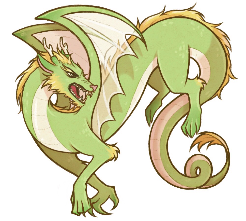
As always, the last step was to draw the final image. This time, I decided to have more harsh and bold lines, to make the creature pop out more, as well as to make it look aggressive. I ended up scrapping the whiskers I drew in my initial sketch, because I felt that there was already so much going on in the face. All in all, I’m very happy with how this design came out.


