In this post, I’ve included WATERCOLOR! Unlike my previous post, the main piece here doesn’t include the previous mediums used, though I’ve included other little paintings below that do use all of the previous mediums.
Before I really hated working with watercolor; it would bleed all over the paper, colors would run into each other, and I had no control of it whatsoever. All of that really bothered me, because I would think the piece was completely ruined when that would happen. Even though I was not the best at using it, watercolor paintings were always so mesmerizing to look at. The outcome of other people’s work always looked so appealing. As I got older and experimented more with watercolor, I was able to avoid some watercolor mistakes, but some of those mistakes were part of using watercolor. It would accentuate the piece because that’s the look watercolor was supposed to give — splashes, blurred lines, and mixed colors.
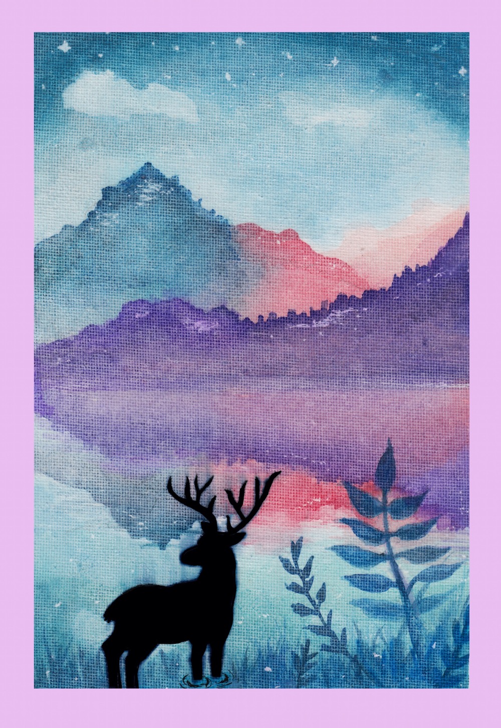
Usually, I have a visual image of how I want my piece to look before I actually draw out a rough sketch. This time was different, however, because I couldn’t think of anything. It was actually more like I had many ideas of what I could possibly draw, but none of them really stood out to me. I ended up just going into the piece not knowing what I should draw, which is why I ended up not using a combination of mediums in my piece. I also did look at a couple of watercolor landscape pieces midway to get ideas, and I stumbled upon this kind of mountain painting another artist had done, so I did get inspiration to form part of this piece. The name of this post is “What We Don’t See on the Other Side of the Mountains”, because of all the buildings that have been built, the other side is hidden away. I chose to include a stag because I wanted it to look full of life, to fit in with the nature around it.
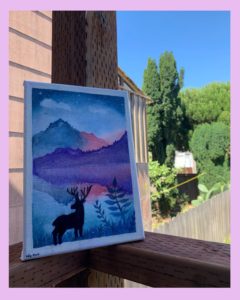
For the featured image, I used watercolor paints as well as watercolor brush pens, to get more vibrant colors. I used a 1.0mm pen to outline a stag, and then went in and filled in the stag with a black watercolor brush pen to create the silhouette of the animal. To finish off the piece, I used a white pen to add little dots and highlights to the piece to give it a more mystical look. I also covered the whole canvas with mod podge to give it a glossy look, but I made a huge mistake and forgot that I had used a gel pen to outline the stag, and so it smeared with the contact of mod podge. To save the piece, I left what I had done and continued to cover the canvas without touching the stag, because there really wasn’t much I could do, other than leaving it alone before it got worse. As a result, it ended up not looking too bad, even with the smeared look.
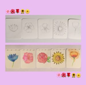
As for the mini paintings I did, it was created from the leftover paint I had used to make the main piece. I did a sketch of each individual flower, then painted a base layer of color for the flowers. Then I went over it with a 0.35mm black pen to give it more detail and shaded it a bit with Prismacolor pencils to give it more color and depth.
(HINT: This next medium is only ONE word. Unscramble the word.)

