Let’s get retro! Nike is one of the biggest shoe companies in the world, and the Nike Swoosh is iconic. The swoosh is so ingrained in shoe and brand culture, it’s impossible to develop something brand new, but I tried. With three attempts at a redesign, I finally settled on a new text design. But first, let’s look into the history of the major footwear company.
History

Nike settled on their final logo quite quickly. Starting with their original name was Blue Ribbon Sports, and they had a lovely logo, with the connected letters, and the ribbon esc font. This was a big factor in my final design, giving the retro lines feel. Then Nike had a little rough patch in logo land, with a weird difference in line thickness, and a strange font choice. But then they found their stride, and settled on the final design, ditching the letters, and completing their journey. Let’s move on to my goldilocks situation of logo building.
Too Hot (Emblem)
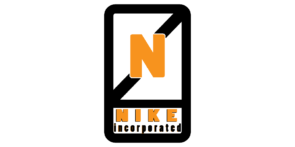
My first attempt was to create a new type of the swoosh. I did a bunch of sketches trying to find a new design, but I settled on a line going through an N, connecting at the endpoints of the letter. I also went with an emblem type logo that could be put on the back of the shoe. I also used the iconic orange I associate Nike with. In the end, I wasn’t really feeling it, but I kept the font and moved on.
Too Cold (Switch Around)
My second try was pretty unoriginal and barely took any time. I was inspired by the 1985 logo, with the text and the big swoosh. But instead of putting the Nike text on top, I put it inside the swoosh. My hope was that because the text was cut out of the swoosh, whatever background you put the logo on, the Nike would become that color. It didn’t work well, and I found my final design.

Just Right (Retro)
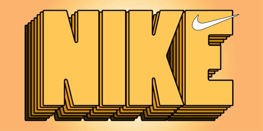
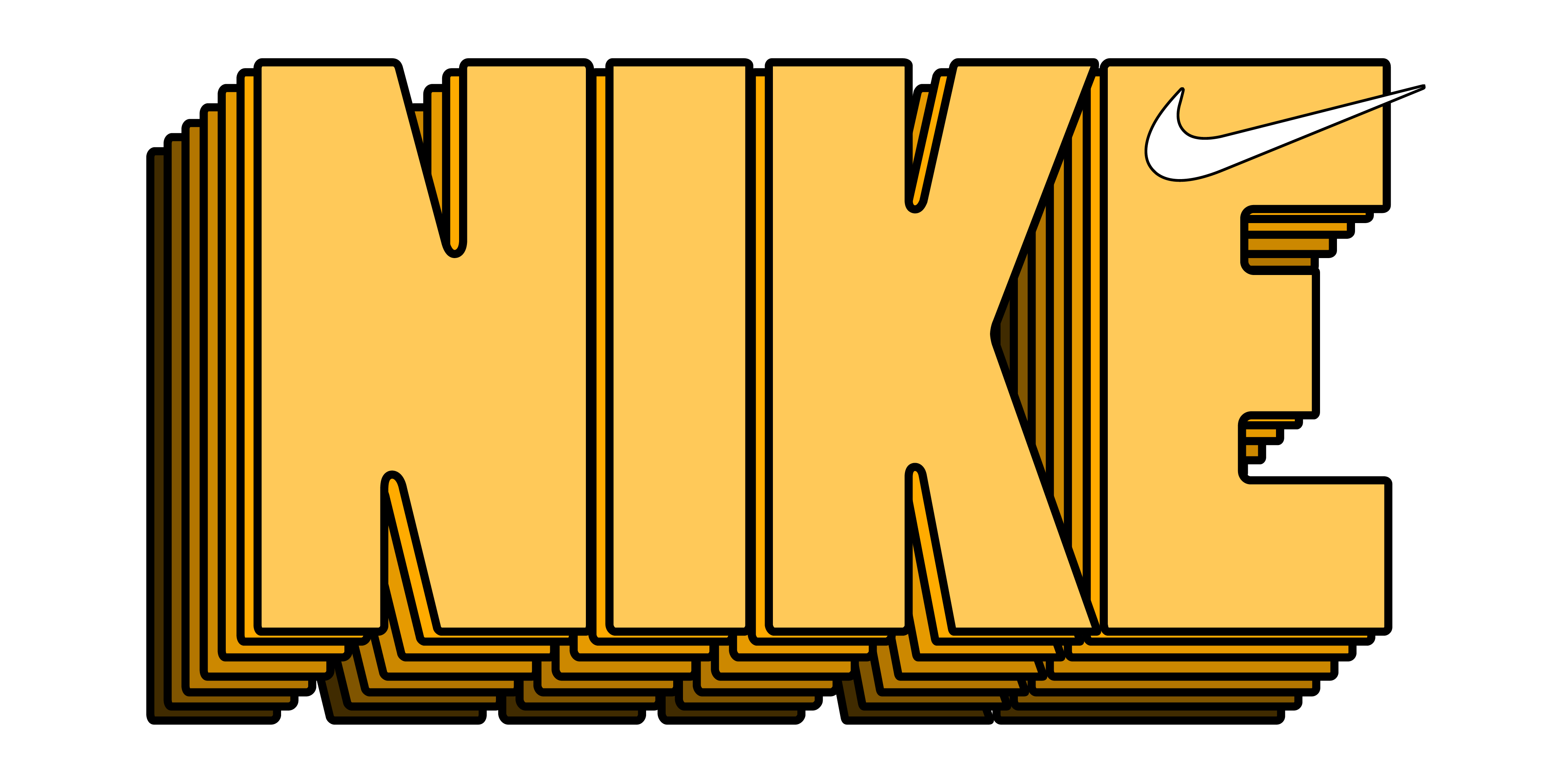
My final design just felt right to me. It feels really retro, while still new. I added a thick outline of the letter and a solid drop shadow effect. For colors, I used a monochromatic scale of the Orange I used in the first logo. I also found a large difficulty including the swoosh into it. I tried putting it at the bottom, and through the middle. I finally decided to just put it at the top, as it fit best being small. It gave me super retro 80 vibes, giving me the same vibe as Blue Ribbon Sport’s logo. I really love it
Billboard
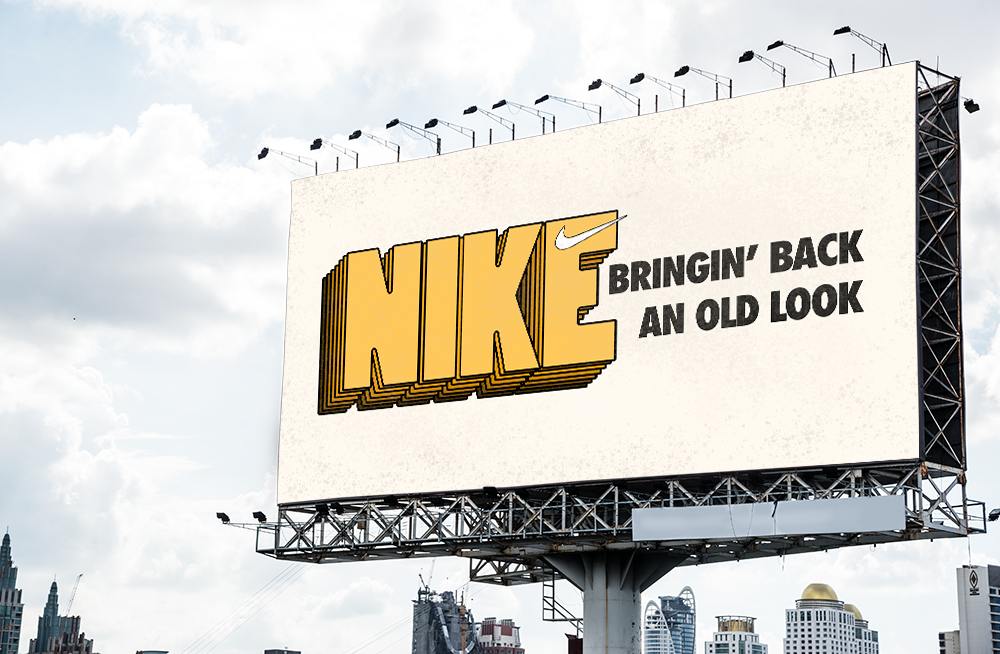
My choice of media for this logo was originally going to be a shoe, duh, but after some tests, I realized that the look of the shoe doesn’t need to change for the new logo to work. So I decided to make a billboard. While no slogan can replace Just Do It™, I feel a logo should have its own slogan. I also added an off-white background and some texture to make it seem more real.
Conclusion
Well, that’s it for my third post. This logo was a lot of fun, especially since Nike is already such a developed brand. I can’t wait to develop new logos in the future, branching out into more artistic designs. Thanks for reading!

