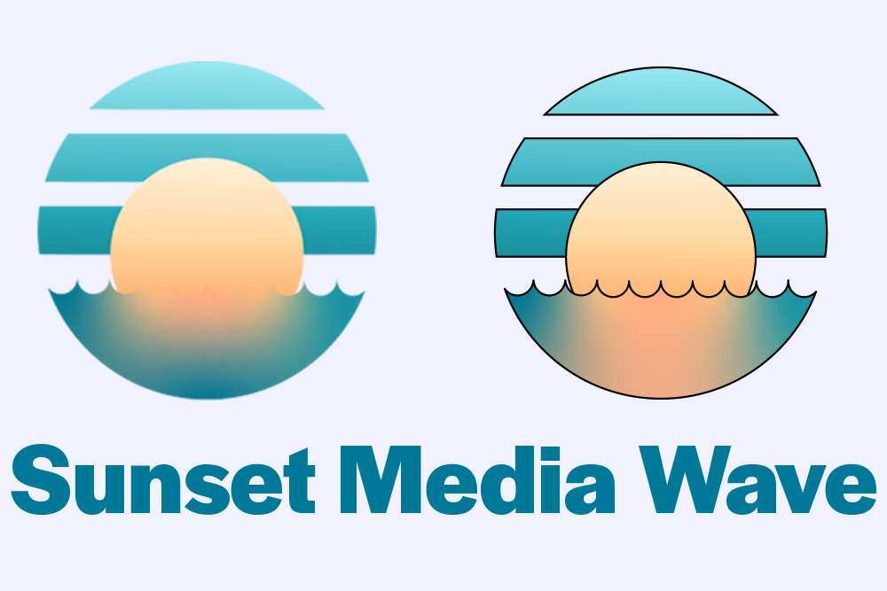
I don’t know what being a corporate shill means, but it only felt right for this amazing organization to get a branding makeover from me, a visual designer, and a part-time narcissist. I’m pretty sure that Sunset Media Wave’s logo is ok, but I have a post due and am running out of ideas, so let’s make a new one!
History
 Wow! What a logo! Under contract, I’m not allowed to complain about my employers’ work, so I’ll just say there’s room for improvement. The things I really like about this logo are the gradient and colors, and the idea of a circular emblem with a wave inside. However, as a professional, I wanted to give the company a few options for the logo, so let’s look at the five variations.
The Base

This was the logo I started with. The key elements are the colors, the line cutouts and the sun overlapping with the blank space, and then disappearing beneath the horizon, like a sunset.
Black and White
This is basically the same logo, but without color. I did move the sun down a bit so you still get that distinct line. This one also feels like the sun in cut out of the picture, giving it a nice feel.
The Detailed

Personally, this is my favorite design. The sky has a soothing gradient that grows darker as it goes down, The sun is reflected in the surface of the water, and I used circle cutouts to show the waves. This design doesn’t include a stroke, which I think makes it feel lighter and brighter, but can feel a little washed out, which is why I made the one below.
The Heavy Stroke

This design includes a thick stroke, giving it a bold impression. However the size of the stroke really makes the whole thing feel darker and heavy, so I went with a more controlled look for the next one.
The Light Stroke
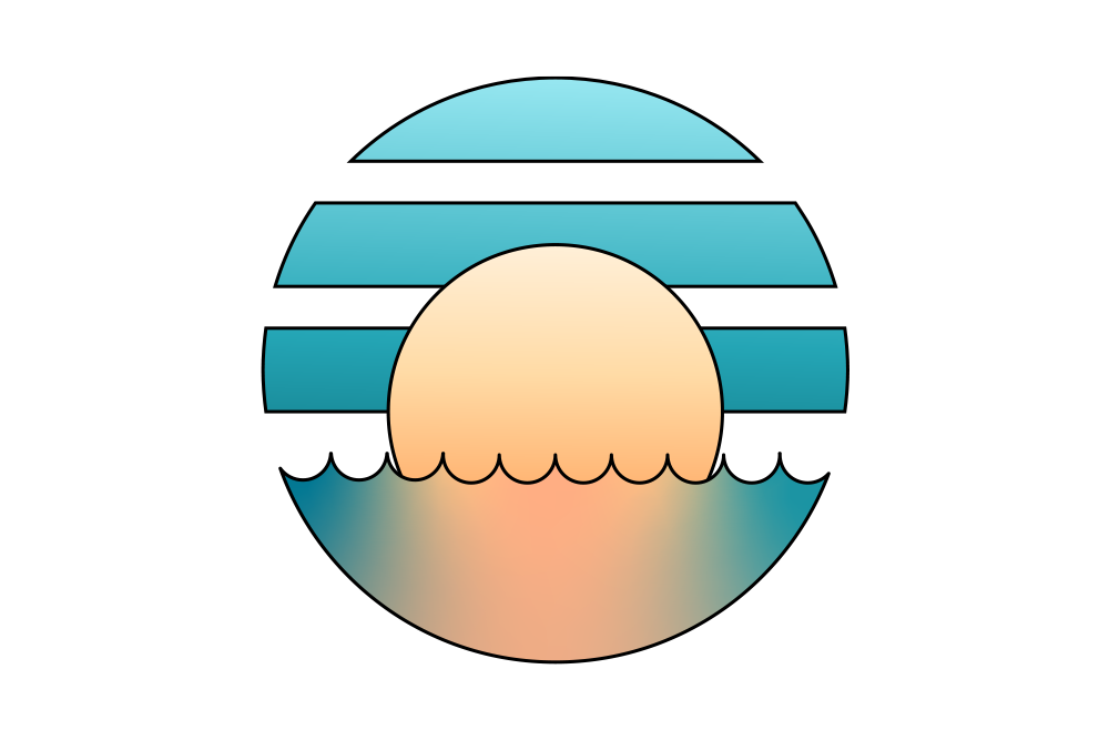
This design is the Goldilocks of the 2 previous. It still feels light and bright, and the stroke offers a bold refined look that helps it to pop out a bit. I don’t know which look you prefer, but this feels like a happy middle ground.
The Text

A pretty emblem is nice, but viewers won’t know which company it’s for! Regarding the text, I wanted something simple, clean, modern, and a medium to bold thickness. While I like the current text, it feels too thin for my taste so I went with a bold Halyard Display font, in a dark solid blue (which matches the emblem). I felt like it would look too complicated if I also gave it a gradient so I preferred for a more grounded, solid approach.
Conclusion
This project was really fun, and a lot different than in my previous posts; I was actually working for the company I was designing for so I got more critical feedback because this wasn’t as hypothetical. Who knows, maybe this logo will be used on my termination letter? Thanks for taking a look at my post, and the final of my ReReDesign’s, but this is not the end of my column! Stay tuned for one more original work that hits pretty close to home. I promise!

