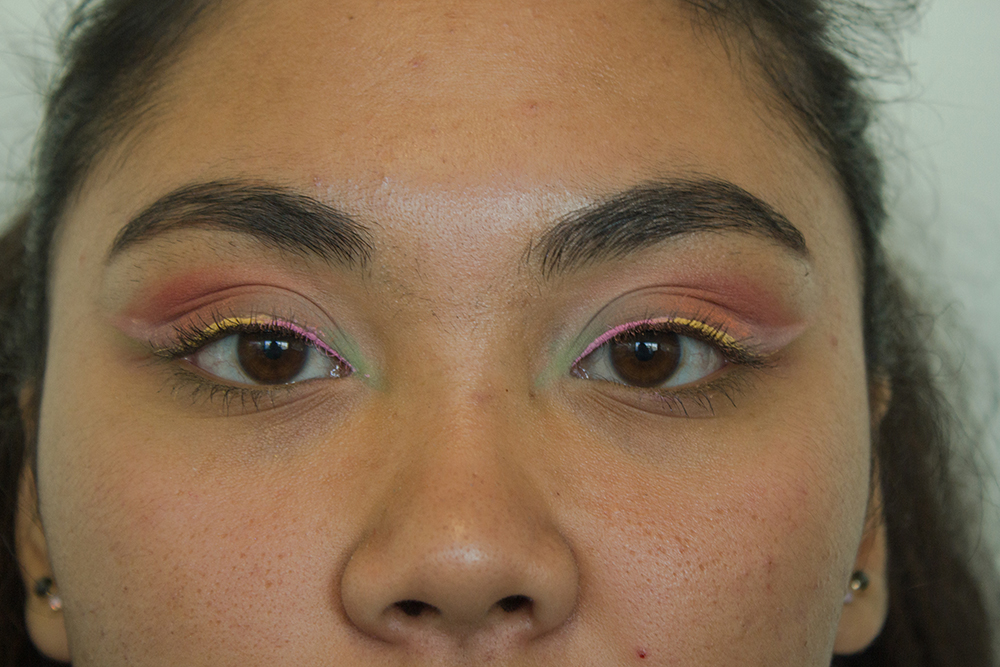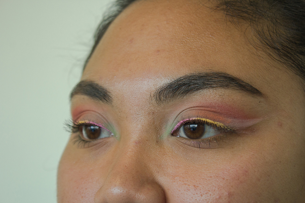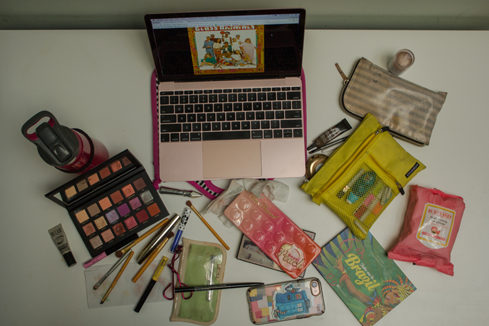
It was hard to decide what to base the look on because there’s a lot going on in the album cover. Even the tracks on the album are all over the place with a mix of chill songs (Youth) and songs that gradually build in intensity (The Other side of Paradise). For my eye look, I decided to try and incorporate every aspect of the album by using the colors on the cover as inspiration.

Mainly, I focused on the orange and reddish tones of the cover. I also used soft colors along with vibrant tones like yellow and pink because in the album there are some colors that pop, even though most of them are a lot more toned down.

The different colors that were used represent how even though there’s a lot going on, when put together the look balances itself out.
Photos by: Ciara Kosai


