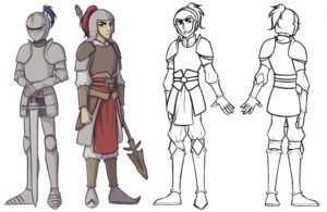
When creating a character, I always keep in mind two things: personality and practicality. In this case, we are designing a knight, so practicality is especially key.

When designing the armor, I wanted to make sure that he (the knight) would be able to move freely without too much restriction. This came easily, since I was referencing and taking inspiration from armors that had been used effectively in medieval times.
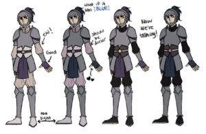
Coming up with a color scheme for him proved to be much harder than the armor/clothing design. When looking at the Chinese warrior, the clothes underneath the armor are lighter. However, when incorporating that element into my design, it looked too bright and happy. The bright colors wouldn’t be useful in a tactical situation, and I wanted the character to seem more brooding and serious. So, I lowered the brightness of the entire color layer and changed the clothing to be black.

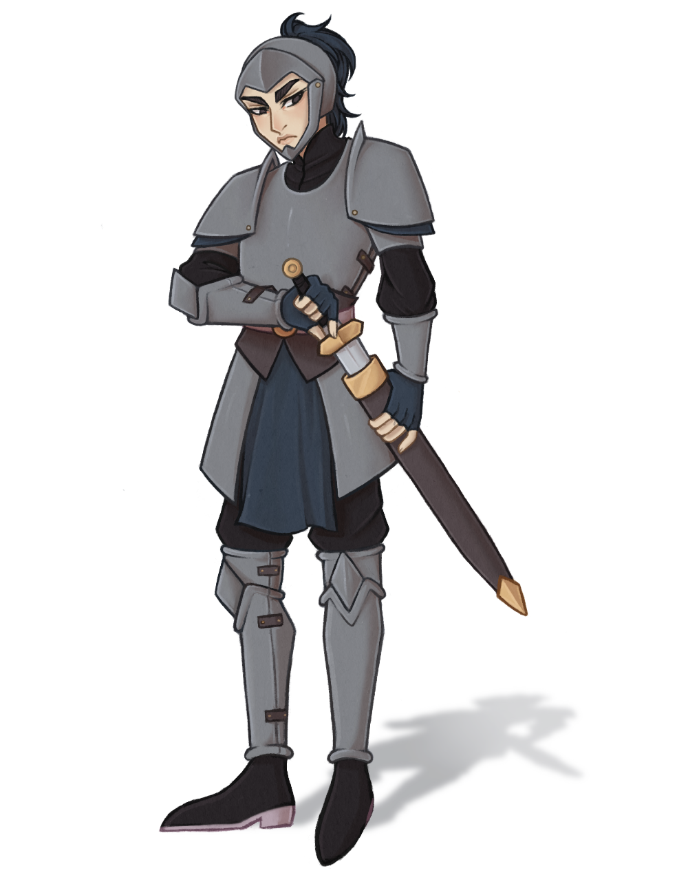
With the color scheme sorted and figured out, I made a final finished illustration. There may still be some issues and problems with the character design, but overall, I’m happy with how it turned out.


