This project has been a marathon, to say the least. When I started, I thought I would have a completed product by the end of this cycle, but that is unlikely at this point. What has really made this project challenging is that I’ve had a solid idea since the beginning of this cycle, but my execution of that vision has changed several times. For this post, I’m sharing some process shots which reveal how many versions of my map there have been. Hopefully my journey inspires all the other marathon runners out there who won’t rest until they’ve reached their ultimate destination!
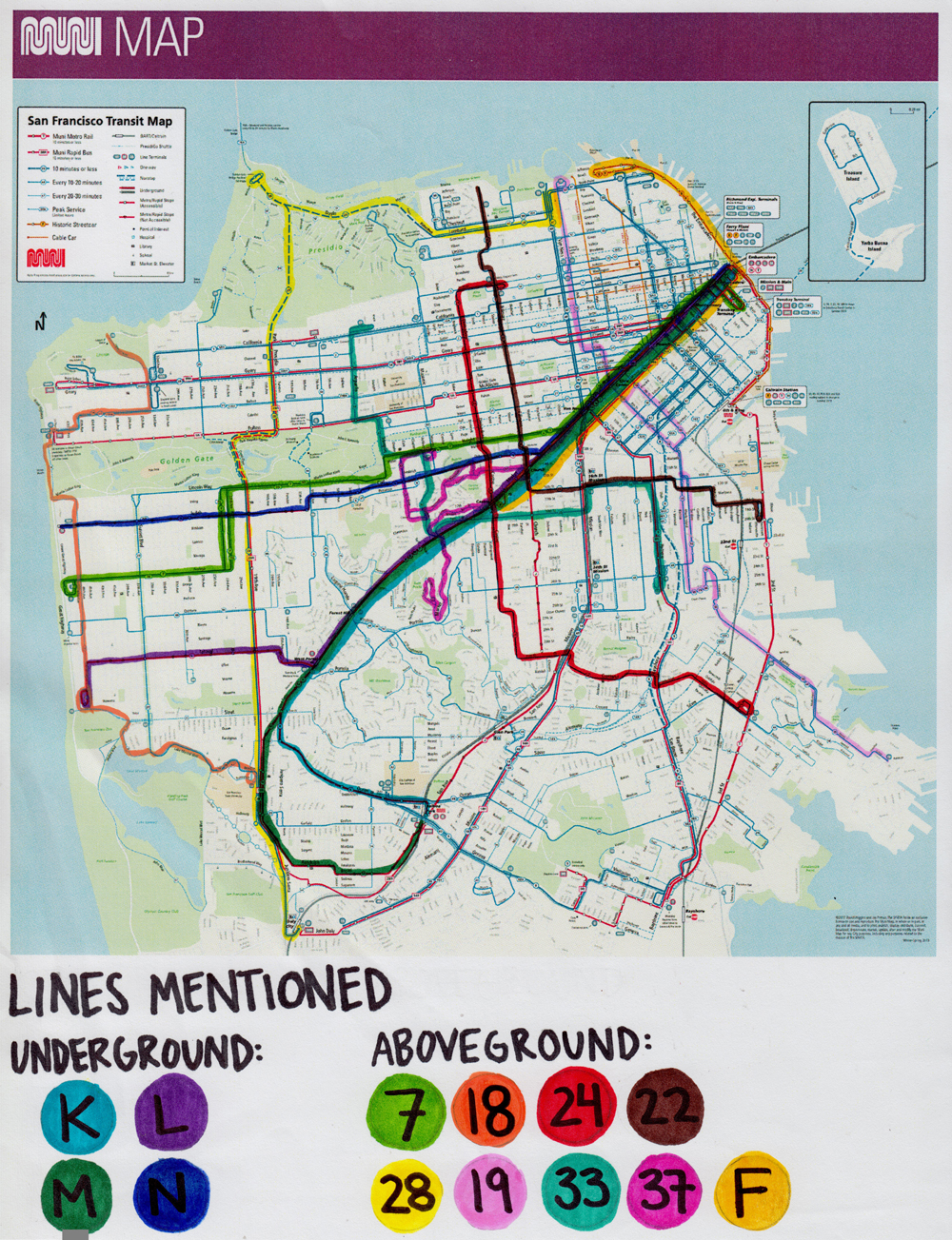
My first idea for the map was a printout of the official MUNI map with thirteen different lines in various highlighted colors. It looked great! That is, until I scanned and reprinted it. Several headaches followed as I tried to fix the weird pixelated effect, but none of them worked. Along these same lines (no pun intended), I was having some layout issues and realized that I would need to cut down the number of lines. So I said goodbye to the baker’s dozen, and said hello to an actual dozen! I repeated my method for Elsie’s Map V.1 on V.2 and it looked fine, but I wasn’t super excited about it. After some brainstorming, I realized that the scanned look wouldn’t mesh well with the digital / handwritten aspect of my project.
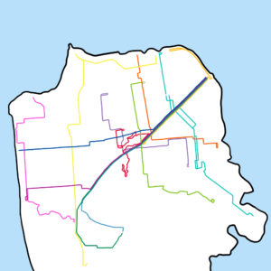
V.3 used the same map, but instead of printing it out, I traced each line in Photoshop. Unfortunately, this method meant that I lost all the detail in the official map, which I had found so interesting in the first place. I decided to lean into the loss of detail for my current version so for V.4. I’ve simplified the bus lines and the level of detail, focusing strictly on landmarks with personal connections. Hopefully, this will be the last version, but who knows!
The featured image is V.1 of my map. Below is V.4, my current work-in-progress!
